Your website home page is the most important page on your website, its the first thing people see when they visit you site, so it has to be built to generate leads!
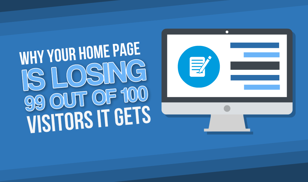
Unfortunately most websites are NOT built to do that! And the average website home page will convert at around 1% which means only 1 person out of every 100 people to visit that page will convert into a lead.
But there is a way to fix this, below are 8 steps you can take to make sure your website home page is set up to generate leads for your fitness, health or wellness business.
#1 – Have something for your website visitors to opt-in to so you can capture their email address.
This is the most important element of having a website that generates leads and 90% of fitness websites do not have it!
People visiting your website for the first time are not going to just sign up for a Package, class or service straight away, what you want to do instead is offer them something for free in return for their name and email address. This way you can get them onto your email list and start to send them an email each week with more free, useful information which will get them to know, like and trust you.
Once you have built that relationship you can then start to email them about specific packages, services or products that they may be interested in.
#2 – Use a compelling headline
At the very top of your website you should have a headline which clearly tells people what you can do for them.
For example: “I will help you lose weight, get healthy and achieve your weight loss goals”
Don’t just use a fluffy vague headline, really tell people what you can do for them, this will tell your visitor that they are in the right place.
#3 – Have a clear call to action
The visitors to your website need to be taken by the hand and given very clear instructions on what you want them to do!
Don’t leave it up to them to make decisions on where to go and what to do on your website. You have less than 5 seconds to get people’s attention and get them to take an action.
So if you want them to fill in the form to claim their free gift you have to tell them to do it.
Getting people to sign up for your free gift is the most important function of your website so I would include a call to action in the video, above the form they need to fill in to claim it and on the button they click to submit the form.
#4 – Use video to engage your website visitors
It’s proven that video, if done correctly will engage people visiting your website, start to build up your relationship with them and more importantly keep them on you site for longer.
#5 – Make it clear what packages, services or products you offer
You want to make it as easy as possible for people visiting your website to see what packages, products or services you offer so include these on your home page with a headline of that package, product or service and then some text that defines who the ideal client is for that package or service
You then want to give them a clear call to action in the form of a button or link that they can click on to find out more about it.
#6 – Don’t use distracting design elements
The number one “Lazy” website design choice is to include a huge image slider right at the top of your home page. These serve no purpose and have been proven to distract your visitors.
Most of these sliders just have stock images on and do not even have any call to action. So they literally serve no purpose other than taking up valuable space which could be used to engage with your visitor and capture their details.
Most “Web Designers” use these to fill up your home page and make it look nice because they don’t know what else to put their.
#7 – Have a Responsive (Mobile Friendly) website
If you’re not sure what mobile ready means, let me explain, older websites that are not mobile ready keep the same layout when viewed on a mobile device, this means that the text and images are very small and difficult to read or it may even cut some of the content off completely. This means that the person viewing the site will need to do that pinching screen thing to make it bigger.
Mobile search is huge and will only get bigger so your website needs to be responsive, a mobile ready site will adjust its layout so the content is easy to read on mobile devices, so rather than shrink all the text it changes the layout so that the text is easier to read and all the other elements on the website such as opt-in forms work correctly.
#8 – Have Social Proof (Testimonials).
As a fitness, health or wellness professional you help your clients to achieve amazing physical and health transformations, you need to use these transformations as social proof to prospective clients that visit your website.
Before and after pictures along with some well written text can work very well and having 4 or 5 of these on your home page can help to convert people either into paying clients or onto your free gift better than any other source of information you have on your website.
Having social proof gives you much more credibility and lets people know that you can achieve the results they want.
Another great tip is to have a headline above each success story that picks out one of that client’s biggest results so that even if the website visitor is just scanning the page they can easily pick out the key results you have achieved for others.